
.png)
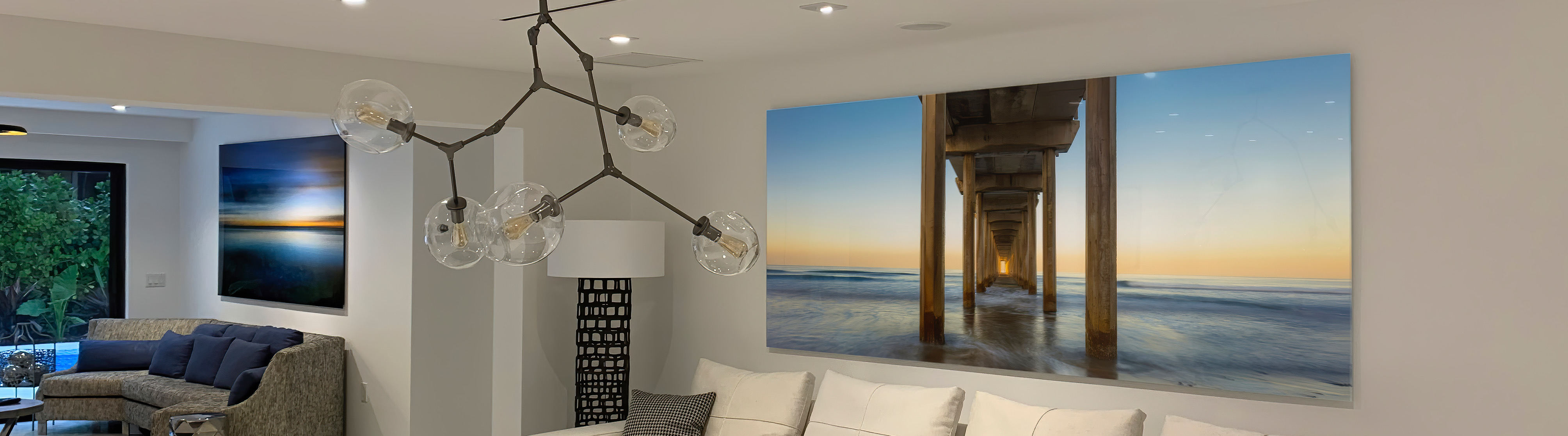
What Does the 70 30 Rule in Art Mean for Composition & Balance?

Most artists think composition is about instinct. Eye for detail, natural talent, gut feeling. But the strongest work follows structure — and if you skip that, you're hoping for magic that doesn't exist. The 70 30 rule won't paint the canvas for you, but it will stop your piece from falling flat. Especially when you're trying to lead the eye instead of letting it wander.

Here's what matters. Splitting a composition fifty-fifty kills tension. Equal halves feel safe, predictable, dead on arrival. But when you push the balance toward 70 percent dominance and leave 30 percent as contrast, the piece starts breathing. That asymmetry creates pull. It gives viewers a place to land and a reason to keep looking.
Why Equal Splits Fall Apart
Balanced doesn't mean boring, but it often ends up that way. When two elements fight for the same real estate, neither wins. The eye doesn't know where to go, so it bounces between the two until it just gives up. We've all seen paintings where the horizon line cuts straight through the middle or the subject sits dead center with nothing driving focus. That's not composition. That's a placeholder.
The 70 30 principle flips that. One side gets priority — color, shape, light, subject, texture — and the other plays support. That imbalance is what creates movement. It's what separates a snapshot from a story.
Where the Numbers Come Into Play
The split isn't about measuring with a ruler. It's about dominance. Seventy percent of your composition should lean into one direction, and thirty percent should anchor or offset it. That could mean color weight, tonal range, spatial distribution, or how much breathing room you give the subject.
Here's how it shows up in practice:
- Warm tones fill most of the frame, cool accents pop in the margins
- Dark values take up the bulk, light carves out the focal point
- Busy textures dominate one zone, smooth surfaces give the eye a break
- Negative space wraps around a compact subject, or the subject floods the canvas with slivers of air
- One element commands attention while secondary pieces guide without competing
The Brain Wants Contrast, Not Symmetry
Human vision craves hierarchy. We scan for patterns, then look for breaks in those patterns. A composition that leans hard in one direction and counters with a smaller, sharper contrast satisfies both instincts. The larger area grounds us. The smaller one grabs us.
That's why the rule works across mediums. Photographers frame skies against slivers of land. Interior designers cluster furniture in one corner and let the rest of the room open up. Graphic artists weight a layout heavy on one side and drop a logo or callout where it can't be missed. Same principle, different canvas.
How to Apply It Without Overthinking
Start with a rough division before you commit. Block out your canvas or frame and ask which element deserves the stage. Then let the rest fall into place around it. Don't lock yourself into exact percentages — this isn't a math test. But if you notice your composition drifting toward a clean fifty-fifty, push it off balance on purpose.
Here's what that looks like in action:
- Sketch the layout first and mark where the weight should land
- Pick one dominant feature and build everything else as support
- Use contrast to amplify the split — light against dark, smooth against rough, dense against sparse
- Test a few ratios if seventy-thirty feels off — sometimes sixty-forty or eighty-twenty hits harder
- Let the focal point live in the smaller zone if the larger one sets the mood

When the Rule Gets Flexible
Not every piece needs a hard seventy-thirty. Some compositions thrive on chaos. Others work best when the balance shifts closer to even. But those are choices, not accidents. If you're breaking the rule, do it because the piece demands it — not because you forgot to plan.
The difference between a strong composition and a weak one usually comes down to intention. Know what you're prioritizing. Know where the eye should go first. If the seventy-thirty framework helps you get there, use it. If it doesn't, adjust. Just don't split the difference and hope it looks fine.
Common Mistakes That Kill the Effect
Trying to balance everything at once is the fastest way to flatten a piece. When every color gets equal weight, nothing stands out. When the subject and background compete for dominance, the viewer checks out. We see this all the time in overcrowded layouts or paintings where the artist tried to cram in too much without picking a focus.
Here's where most compositions fall apart:
- Centering the subject with no offset or supporting elements
- Using too many competing colors without a clear dominant palette
- Giving equal attention to foreground and background so neither registers as important
- Forgetting to check tonal balance — if everything's midtone, the eye has nowhere to rest
- Ignoring negative space and filling every inch with detail
Documentation Backs Up the Decision
If you're serious about composition, track what works. Save reference photos, thumbnail sketches, color studies. Look at pieces you admire and reverse-engineer the balance. When preparing your files for professional output, understanding how artists in Miami prepare files for printing can help preserve that compositional intent during reproduction. You'll start noticing the seventy-thirty split everywhere once you know what to look for.
Keep a visual record of:
- Compositions that landed strong and why they worked
- Layouts where the balance felt off and how you'd fix them
- Color ratios that created the mood you were chasing
- Sketches showing where you placed dominance versus support elements
- Finished work compared to early drafts to see how the structure evolved
Strong Work Starts With a Framework
Building a piece without thinking about dominance is like walking into a room and hoping the furniture arranges itself. It might work. Probably won't. The seventy-thirty rule isn't magic, but it's a reliable starting point that keeps compositions from drifting into static symmetry. Many professional creators understand this principle when working with art printing services that can translate their compositional choices into physical form. Whether you're exploring canvas prints, considering metal surfaces, or evaluating ultra HD print on acrylic glass, the compositional framework you establish determines the final impact. For those seeking traditional presentation with strong compositional impact, framed art options provide museum-quality results that honor your design decisions.
We help artists and designers stop guessing and start building with intention. Whether you're framing a shot, laying out a page, or blocking in a painting, the structure matters as much as the subject. Get the balance right, and everything else follows. Miss it, and even the best technique won't save the piece.
Let’s Bring Your Vision to Life
We know how much thought and care goes into every composition, and we’re here to help you showcase your art with the clarity and balance it deserves. If you’re ready to see your work printed with the same attention to detail you put into creating it, let’s talk. Call us at 305-754-3888 or request a quote and let’s make your next project stand out.